suppo
Design System
Foundations · Atoms · Molecules · UI-organisms
Logo & Favicon

logo — black
/images/logo-suppo-black.svg

logo — white
/images/login-logo.svg

favicon
/favicon.png · 128×128
Colors
Primitives (palette, unique values)
grey-light
#F3F2EE
grey-medium
#DDDCD6
grey-dark
#6B6B6B
beige
#DFD7D7
green
#77763E
lime
#DEE343
orange
#FF7F4A
orange-dark
#C0480A
pink
#F6DBF6
text-primary
#000000
white
#FFFFFF
button-primary
#605F25
grey-tint
#F0F0EC
grey-tint-hover
#EFEFEC
Roles · Surface → primitive (references)
background
→ grey-light
foreground
→ grey-dark
border
→ grey-medium
input
→ grey-medium
ring
→ lime
Roles · Brand → primitive (references)
primary
→ green
secondary
→ grey-medium
accent
→ orange
Roles · Semantic → primitive (references)
destructive
→ pink
muted
→ grey-medium
Gradients (lab range scales)
gradient-pink-lime
gradient-orange-lime
Typography
Inter · 60 / 60 · Light · −2pxSuppo health hub
PF Regal Display · 60 / 60 · ItalicSuppo health hub
Inter · 40 / 44 · Light · −1.2pxSuppo health hub
PF Regal Display · 40 / 44 · ItalicSuppo health hub
Inter · 30 / 34 · Light · −0.8pxSuppo health hub
Inter · 30 / 34 · Medium · −0.8pxSuppo health hub
Inter · 20 / 24 · Light · −0.4pxSuppo health hub
Inter · 20 / 24 · Bold · −0.4pxSuppo health hub
Inter · 16 / 20 · LightSuppo health hub
Inter · 16 / 20 · SemiboldSuppo health hub
Inter · 14 / 16 · RegularSuppo health hub
Inter · 14 / 16 · BoldSuppo health hub
Inter · 12 / 12 · Medium
Spacing
Usage — see DESIGN.md → Layout: xxs/xs inside a component · s/m between elements · l card padding · xl between blocks · xxl between sections
Corner radiuses
xs
2px · rounded-xs
s
10px · rounded-md
m
14px · rounded-m
l (pill)
99px · rounded-pill
Plus a shadcn-compat layer: rounded-sm 8 / rounded-md 10 / rounded-lg 12 (debt — needs unifying, see DESIGN.md)
Elevation
Shadow — only on modals, popups and dropdown menus. Cards, pages and everything else static are flat, no shadows.
flat
cards, pages
modal
Dialog / AlertDialog
popup · dropdown
0 4px 24px / 10%
Input
States
Hover and focus are real CSS states (border/text green), not a mockup. Hover the cursor or click into the field below in Playground to see it.

<Input placeholder="Search athletes..."
leftIcon={<Icon name="search" variant="line" width={20} height={20} />} />Textarea
Sizes
States
Ghost (borderless — inside a host surface, e.g. chat composer)
<Textarea size="sm" maxLength={200} showCount placeholder="Write your note here..." />Checkbox
States
unfilled — прозрачная заливка вместо белой, для чекбокса на frosted-подложке (lab-results header)
<Checkbox label="High" checked={true} onChange={setChecked} />Label
Variants
<Label htmlFor="email" required>Email</Label>
Icon
By category — variant=line (основной вариант в приложении: 63 использования против 1 default / 4 green)
Navigation


Actions


Status


Content


Text formatting


Variants — default · green · white (на тёмном) · line. Градиентный «active» убран (в приложении не используется). У doc / attach / plus нет green-варианта (в Figma).
Default


Active (залитая оливковая плашка)


White (on dark background)


Line
<Icon name="search" variant="line" width={30} height={30} />Coming Soon
ComingSoon (shared/ui/coming-soon, 2026-07-21) — tooltip-обёртка для кнопок, выключенных до бэкенда/дизайна. Наведи, чтобы увидеть подсказку.
TooltipProvider + span-триггер вокруг disabled-кнопки: сам disabled-элемент гасит mouse-события браузером, поэтому hover ловит span, а кнопке нужен disabled:pointer-events-none (уже в Button/IconButton), чтобы клик/hover не перехватывался ею поверх span.<ComingSoon> <Button variant="secondary" disabled>Add result</Button> </ComingSoon>
Avatar
Variants (fallback background color + paired text color, Figma 725:40652)
initials — свои буквы вместо автогенерации из name (чаты с короткими названиями, напр. «Alarm!!!» → «Al»)
Sizes
States
<Avatar size="md" name="Dr. Amanda Haffa" src={athlete.avatar} />Spinner
Sizes
<Spinner size="md" label="Loading…" />
Skeleton
Variants
<Skeleton variant="rectangular" className="…" />
Top Navigation
Top Navigation (components/layout/top-nav, реальный — навигация и logout рабочие)
Notes Header Bar
Notes Header Bar
Tabs
Variants
States
Equal-width group (login specialization)
<TabGroup items={items} defaultActive="overview" onActiveChange={setActive} />StatusChip
States (clickable)
<StatusChip checked={true} onChange={setChecked} />BackLink
States
<BackLink onClick={() => navigate(-1)} />FormField
States
Clinician's work email
Enter a number greater than zero
Clinician's work email
<FormField label="Email" required htmlFor="email" hint="Work email">
  <Input id="email" type="email" />
</FormField>
Dropdown
States (actually opens)
<Dropdown label="Filters" align="end">
  <DropdownSection title="Category">…</DropdownSection>
  <Button variant="tertiary" className="w-full">Apply</Button>
</Dropdown>
Lab Compare Filter (entities/lab-result, реальный пример — Status + Dates, макет 1060:21369)
Card
Variants
Iron
Stable101 mg/dL
Blood Glucose
High177 mg/dL
Vitamin D
Low28 ng/ml
default — white, neutral value. alert — lime→orange gradient, high value / attention / dangerous. status — lime→pink gradient, low value / status. The pin icon actually unpins the card — clickable.
James Glassdor
Athlete Profile Card — one more example of card content, same flat white surface as default.
Nutrition Plan
Plan High Protein 3000 Kcal
Weekly checklist
Nutrition Plan Card — same flat white surface, different content layout.
Injuries & problems
Symptoms
Health Snapshot Card — frosted surface (bg-white/40) grouping injuries + symptoms under one header.
Structural variants (header / content / footer)
Slots: header / content / footer
Slots: header / content / footer
Sizes
auth
Responsive width, capped at 450px.
Updated 2 days ago
<Card variant="default">
  <CardHeader>…</CardHeader>
  <CardContent>…</CardContent>
</Card>
Key Indicators
Key Indicators Row (entities/athlete — актуальная раскладка профиля: высокий тайл Heart rate + стопка Stress/Weigh, 3 статичных тайла с mesh-градиентами)
Heart rate
Stress
Weigh
BMI 28.7 overweight
Document Item
Document Item
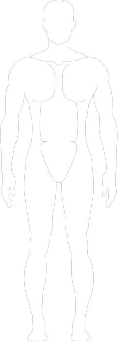
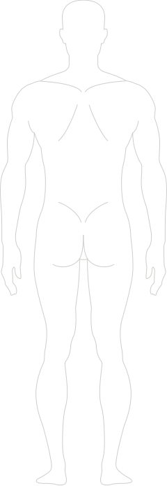
Injury Map
Injury Map
Tooltip
Variants (placement)
States (hover / click)
<Tooltip content="Vitamin D · 18 ng/mL" placement="top">
  <button>…</button>
</Tooltip>
Note cards
TodoCard — обложка заметки (Recent notes на /dashboard, welcome), 4 варианта фона
NoteListRow — строка списка (My notes без аватара · Linked с аватаром клиента)
Weekly protocol draft
Jul 21
Review lab results
Linked with Aline Willas
NoteBanner — цветная обложка модалки заметки (4 варианта, иконка справа переключает цвет)
Dashboard Calendar
WeekSchedule — неделя пн–вс с событиями (левая колонка «My calendar» на /dashboard). Клик по событию открывает модалку.
MiniMonthCalendar — месяц (правая колонка «My calendar»); «Add event» неактивна (Coming soon — бэкенда нет)
Form inputs
ClientLinkField — привязка заметки к клиенту (поиск по имени, попап совпадений)
TagInput — мульти-тег (гости события): чип на имя, автокомплит по suggestions, Enter/запятая добавляет
DatePicker — поповер выбора даты (форма правки события)
TimeSlotSelect — выбор времени из готовых часовых интервалов (форма события)
FileAttachmentCard — карточка прикреплённого файла (модалки заметок), меню Open/Download/Delete. На белом фоне — как в модалке (сама карточка grey-light, на сером фоне кита сливалась).
RichTextEditor + FormattingToolbar — поле заметки с форматированием (Bold / Italic / Underline / List / Link)
Modal (BaseModal)
States (actually opens: portal, esc, click outside)
<BaseModal open={open} onOpenChange={setOpen} title="Add note" width={560}>
  …
</BaseModal>Add Note Modal (features/add-note, actually opens)
Lab Result Chart Modal (features/lab-chart, actually opens)
Add Athlete Modal (entities/athlete) — создание клиента на /athletes: поля кита + статус через Dropdown. Здесь запись в БД не делается (onCreate — заглушка).
AlertDialog
Variants (actually opens; click outside is blocked)
<AlertDialog open={open} onOpenChange={setOpen} variant="destructive"
title="Delete note?" confirmLabel="Delete" onConfirm={handleDelete} />Table
<Table columns={columns} data={rows} rowKey={(r) => r.id}
  rowAction={(r) => <MenuButton row={r} />}
emptyState={<EmptyState title="No results yet" … />} />Cell variants: TableStatusCell / TableActionIconsCell (clients table)
TableActionIconsCell: адаптивный overflow — при узкой колонке хвост группы уходит в «…» (≥2 в меню)
{/* label обязателен: тултип + aria-label + текст пункта меню.
   При нехватке ширины хвост группы уходит в overflow-меню «…»
   (последний прячется первым; меню — при ≥2 скрытых). */}
<TableActionIconsCell
  actions={[
    { icon: <Icon name="pin" variant="line" />, label: 'Pin', onClick: togglePin },
    { icon: <Icon name="pen" variant="line" />, label: 'Edit' },
    { icon: <Icon name="note" variant="line" />, label: 'Note' },
  ]}
  trailing={{ icon: <Icon name="delete" variant="line" />, label: 'Delete', onClick: handleDelete }}
/>Toast
States (auto-close 4s + swipe + close button)
<ToastProvider swipeDirection="right">
  <Toast open={open} onOpenChange={setOpen} duration={4000}>
    <ToastTitle>Note saved</ToastTitle>
    <ToastDescription>…</ToastDescription>
  </Toast>
  <ToastViewport />
</ToastProvider>EmptyState
No athletes yet
Add your first athlete to see their card here
<EmptyState
  icon={<Icon name="person" variant="line" width={40} height={40} />}
  title="No athletes yet"
  description="…"
action={<Button variant="primary">Add athlete</Button>} />Form (zod validation)
States (submitting with empty fields shows errors)
const form = useZodForm(schema, { defaultValues })

<Form form={form} onSubmit={handleSubmit}>
  <FormField label="Email" required error={form.formState.errors.email?.message}>
    <Input type="email" invalid={!!form.formState.errors.email} {...form.register('email')} />
  </FormField>
  <Button type="submit">Submit</Button>
</Form>Lab Results Section
Lab Results Table (entities/lab-result, реальный пример композиции — макет 1059:20659): frosted-подложка, Compare-фильтр (Status + Dates), референс возле названия, меню строки Pin/Show diagram/Add note/Remove
Lab results
<LabResultsTable
  panels={['12.07.2026', '20.02.2026', '05.09.2025']}
  results={[{ id: '1', name: 'Vitamin D', reference: '30–100 ng/mL', values: { '12.07.2026': { value: '16 ng/mL', status: 'low' } } }]}
  onShowDiagram={handleDiagram}
  onAddNote={handleAddNote}
/>Team Activities (Chat)
TeamChat (entities/chat) — блок «Team activities» на профиле клиента: слева список чатов, справа переписка; вкладка Care team. Полностью интерактивен (выбор чата, отправка, вкладки, add/remove участника).
Team activities
Calendar Event Modal
CalendarEventModal (entities/calendar) — карточка события с /dashboard: встреча (ссылка-созвон, время, гости) ↔ ивент-заметка (цветной баннер). «…» → Edit (пикеры даты/времени) / Delete.
AddEventModal (features/add-event) — создание события с /dashboard: переключатель Meeting | Reminder меняет набор полей (у встречи — ссылка-созвон и гости, у напоминалки — цвет). Здесь событие никуда не попадает (onCreate — заглушка).